LOGO FOR LOYALTY PROGRAM
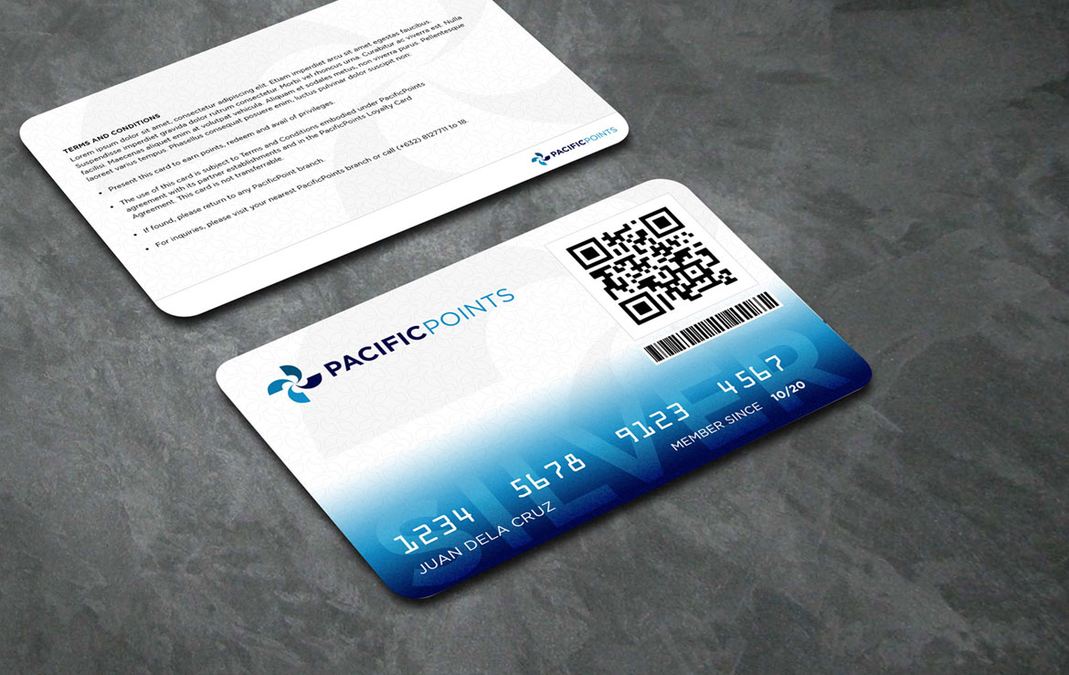
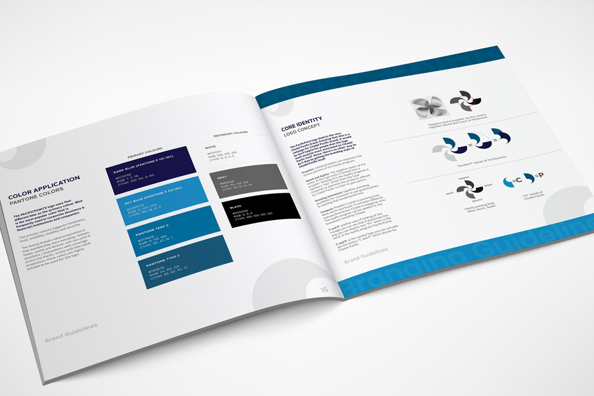
This project was one of the largest I’ve worked on, where I had the opportunity to design the logo, loyalty cards, app, and website for the client. For the logo, I used fan blades to symbolize dynamism, growth, and movement, while also subtly referencing the four founding sister companies—SHELL, FOODY’S, IT&E, and UNITED MILEAGE PLUS—where the loyalty program can be redeemed. The goal was to create a cohesive design that reflected both the identity of the brand and the collaboration between these companies. I was also asked to do their website design, their app design and their loyalty Card. I’m truly grateful for the opportunity to be part of such a major project, and yes, they compensated me well for my work. www.pacificpoints.com

See More of My Projects